
A few weeks ago I started doodling geometric tiled shapes and seeing what happened when I coloured them in different ways.

"That was interesting" I thought, "maybe I could use that for a crochet pattern one day. Not now obviously because I've got too many things on the go already." So I put the sketches away, feeling smug at my self control. Then this happened ...

In my defence, I did wait a whole day before starting to crochet. The plan I was trying to recreate is a combination of squares and elongated hexagons which gives the effect of squares on top of squares.

Can you see the big squares tilted on their points and the smaller, straight squares on top of them? I thought I could vary the texture on the different sections so that the top squares were quite complex and the ones underneath were simpler.
Working out a textured pattern for the top squares was quite straightforward. This is the start - I wasn't quite sure whether to start with a neutral cream or one of the colours.

I decided I didn't like the cream in the middle and that I wanted to see more of the central colour.

As you can see, I've added a few rounds and finished the squares off with a cream crab stitch edging. I'm rather pleased with this edging as it will stand above the rest of the crochet, marking the edges of the squares. I'm planning to use it on the bigger squares too so that the eye is drawn to them.
Isn't it interesting how different those two squares look, just by swapping the colours round. I think I like the one with the green in the middle best. So far, so good but then I started questioning my colour choices. Now I really like shades of blue and green like this and I've used them quite a lot.

This is Stylecraft Special DK in, from left to right, Grass Green, Kelly Green, Green, Cream, Royal, Lapis, Aster and Cloud Blue. But ... my original idea was for something a bit more subtle and here I was, back with my bright primaries.
I had the idea of using two sets of colours - one for these top squares and another for the squares underneath. I wanted to divide up the squares underneath too so that the outer section matched the top squares. This gave me elongated hexagons that looked like this.

This was my first attempt. If you imagine four of these sewn together at the red points, you can see that you'd get a red / orange / yellow square (with cream edging) and then a bit more of the blue and green.
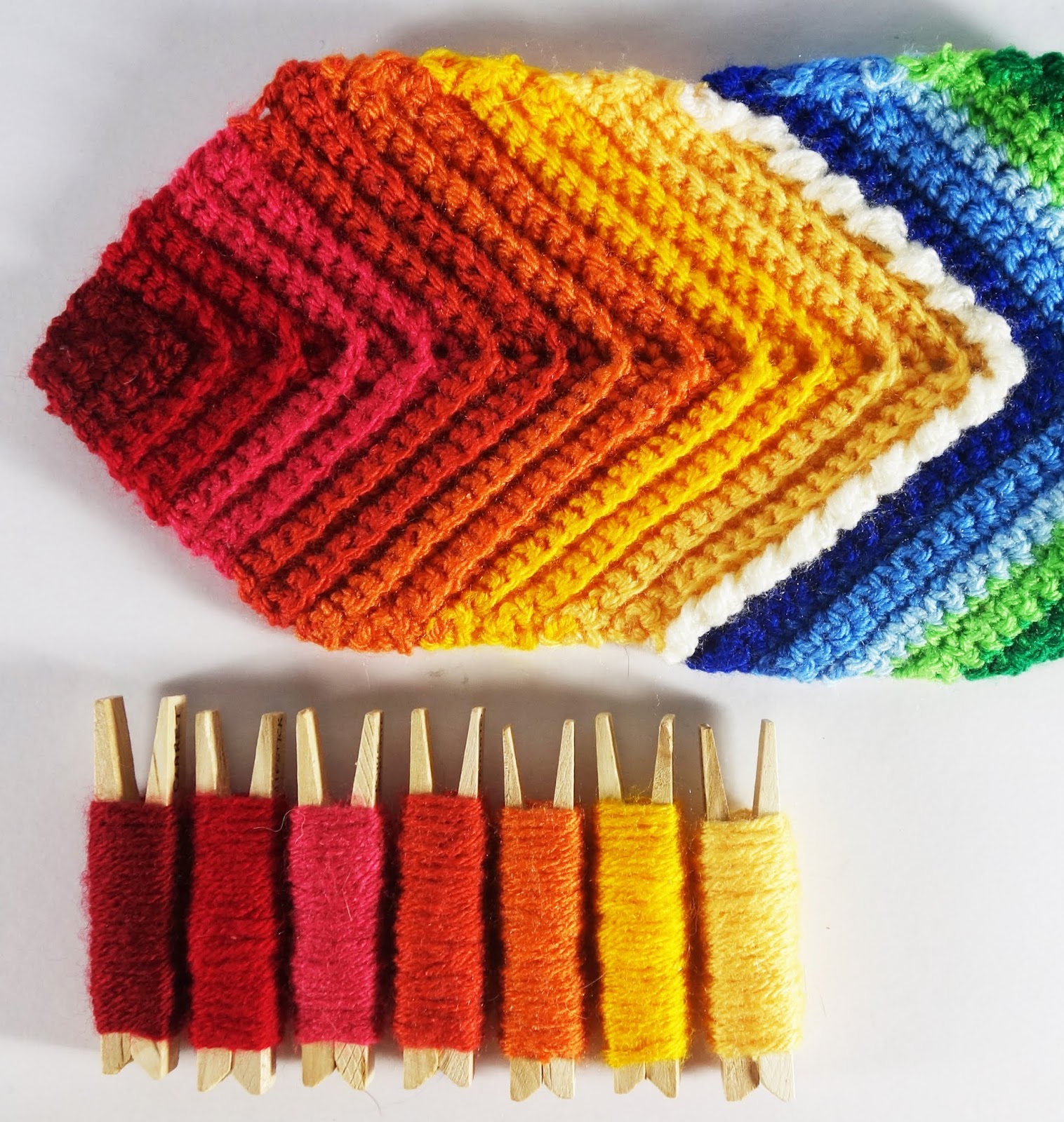
Again, I'd gone for some of my favourite bright colours. From left to right, Garnet, Lipstick, Pomegranate, Tomato, Spice, Sunshine and Saffron. Not that I use this yarn a lot but I can name lots of them by sight.
I fiddled around with the actual design, making the red section more textured and increasing the blue / green part which was better.

But I wasn't really happy with my colours. However much I like them, I couldn't really call them subtle and, when I put the two shapes together, the whole thing was definitely far too busy.

So, it was back to the drawing board - or, rather, back to the yarn pegs. These are so useful for choosing colours. After a brief flirtation with mixing up some random colours ...
 |
| Citron, Candyfloss, Empire, Silver, Turquoise, Lemon and Fuchsia Purple |
... quite pretty but not really me, I tried a more orderly range of greens and mauves. There's a colour name you don't often hear now - mauve - conjures up memories of the 1970s for me and the blue rinsed hair of my Great Aunty Eva.
I quite liked this one, although I can't say it's particularly exciting. I thought the cream section might be too big in the first one so I swapped it with the palest mauve the second time round ... but then it changed the shape of the central motif from a square to something more like a cross.


 |
| Petrol, Storm Blue, Duck Egg, Cream, Parma Violet, Lavender and Violet |
I quite liked this one, although I can't say it's particularly exciting. I thought the cream section might be too big in the first one so I swapped it with the palest mauve the second time round ... but then it changed the shape of the central motif from a square to something more like a cross.
I did feel I was getting nearer to my original idea though; something Spring-like that would make you think of the new season's flowers. So, after more playing around with colour pegs, I came up with this.

Now these colours I like. They shout "Primroses" and "Sunshine" to me; I can feel enthusiastic about them. From left to right, they are Lime, Mustard, Citron, Lemon, Pistachio, Meadow and Cypress - even the names sound like spring (although possibly not mustard).
Here are two squares with the colours swapped round; I think the one with the yellows on the outside is lovely and sunny.

I couldn't decide between them so I knitted two of the long hexagons, one starting with the greens and one with the yellows. The colours seem to work best if both the top and bottom squares start with the same colours so here is the 'green first' version ...

... and here's the yellow one ...

I think I prefer this one; somehow it looks better with the slightly darker greens on the outside, more like the leaves round the flowers perhaps? I'm happy with the textures too. The top square has a range of stitches and textures, the yellow bottom square is a simple ridged pattern and the green on the outside is just double crochet, changing colours every row to give a muted, blended effect.
Finally, after many late nights and a lot of crochet, I think I know what I'm doing now with this design. The next thing to do is to weigh all the balls of yarn I'm going to be working from to keep track of how much yarn the pattern uses. I won't be able to include the two shapes I've already crocheted but I'll add on a bit for them when I work out the final amounts.
I'm not sure how big this needs to be to look good, or what I'm going to do with the edges ('cut off' the green sticky out bits or add half hexagons?) but at least I can make progress now. I'd like to call it something to do with primroses I think - not 'Primrose Path' though which is a fun-filled path that leads to disaster. Any other suggestions?
I'm wondering if the colours look diffrent to you now. My favourites change around the year...
ReplyDeleteI'm still happy with the primrose colours. I pretty much stick with bright colours all year round - not very sophisticated.
ReplyDeleteMy problem with colours is that I love knitting colourful ones but am somewhat less keen to wear them!
ReplyDeleteI don't knit things to wear so that problem doesn't arise. Mind you, I like wearing bright colours.
ReplyDeleteI aspire to wear what I knit but the two really aren't coming together at the moment... my hands find knitting with anything other than wool a trial.. Also I've just been trying to knit some socks for Jim and I can't cope with the yarns with 25% nylon in them... and it turned out he didn't like the feel either.
ReplyDelete